Psychological Effects of Colors in Interior Design
Interior Design & the Psychological Effects of Color
This is a guest post from Orlando Property Management, a local property management company experienced in Orlando's real estate and rental property markets.
Colors guide emotions, regulate mood and influence thoughts. That's why the color choices you make in interior design are far from arbitrary. The chosen colors affect the quality of everyday life. Scientists say that colors don't exist in real life. Your brain interprets certain electromagnetic waves as colors. Regardless of these mechanisms, color psychology focuses on the undeniable effects of colors on our lives.
"Pick the right colors for interior design and you'll support the emotional well-being of the people living inside," says Orlando PM. One aspect of this design process is creating harmony. The different colors should work well together. In this article, we'll explore the fascinating psychological effects of colors in your home and workplace. After finishing this piece, you are fully equipped to pick the best colors for the living and working spaces.
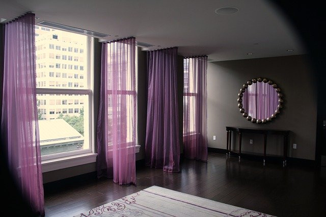
Purple in Interior Design
Purple is a color that defines luxury and opulence. Throughout the times, purple has been associated with royalty. When you use lighter hues of purple, it's possible to bring calm tranquility into the living spaces.
You can use purple to complement beige and yellow tones. Also, various shades of lavender work well in bedrooms. Some people claim that lavender tones help them to sleep better.
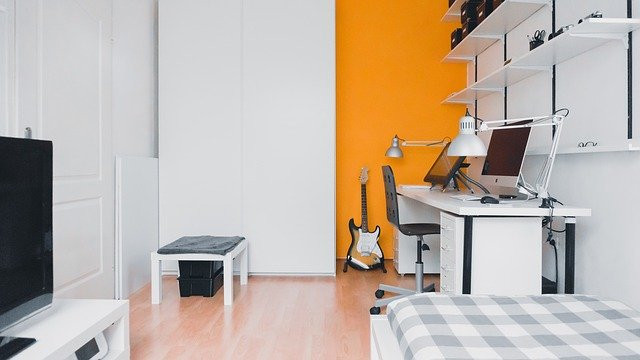
Orange in Interior Design
Orange embodies liveliness and fun. That's why orange is a great color to use in schools, dormitories, and creative organizations. Rooms colored in orange foster social interaction and openness in meeting new people.
Did you know that orange stimulates appetite? You could use shades of orange in your kitchen for that exact purpose. Also, this color is a nice choice in children's rooms.
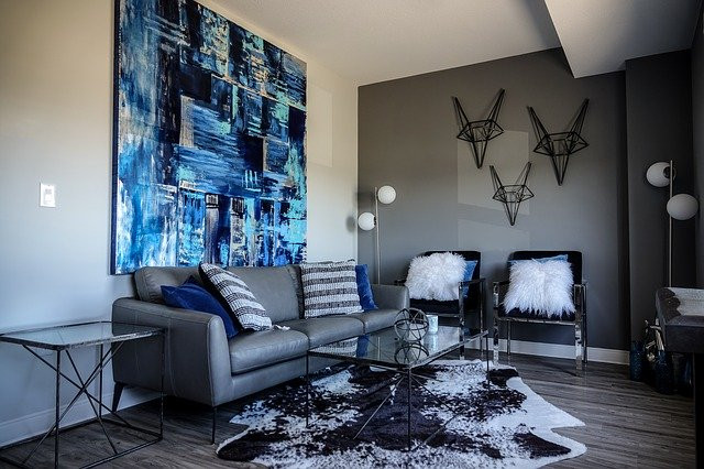
Blue in Interior Design
When asked about the favorite color, blue is one of the most frequent answers that people give. Blue is linked to many unique concepts, including faith, loyalty, trust, and truth.
Without a doubt, blue has mostly positive associations. And blue provides a calming effect, which is exactly why this color is often used in bathroom and bedroom design. But you should always balance the blue using complementary colors. Too much blue could contribute to a depressive ambiance.
Yellow in Interior Design
Yellow, a sunny color, makes every room bright and inviting. This color has many connections, including the following symbols:
- Springtime
- Warmth
- Sympathy
- Happiness
- Prosperity
Be aware, though, that using too much yellow overstimulates the mind. And darker shades of yellow won't work well in interior design. This type of yellow is connected to jealous feelings or sickness.
Red in Interior Design
Red energizes and stimulates when it's used in interior design. Since this color stimulates appetite, interior designers often used it in kitchens and dining rooms.
But use too much red and you risk overstimulation. Color psychologists recommend using red sparingly. The best strategy for using the color of passion and love is to incorporate it into balanced color schemes.
Green in Interior Design
Green is often used in offices and living rooms as it provides a fresh and natural look to working and living spaces. It is said that green has similar effects as blue. When you use green too much, it can backfire and break the harmony in the interior space.
Definitely incorporate green if you want the design to convey nature and growth. Most of the concepts related to green are positive. However, in some cultures, green may carry negative meanings as well.
Black in Interior Design
Black works best as a highlight color. Use black to accentuate, instead of just covering surfaces with it. When you have too much black color in your room, the atmosphere turns negative and grim.
Smart use of black creates a sophistication that no other color could match. That's why it's often used in offices and governmental buildings. Black conveys formality and authority when used in the right amount.
White in Interior Design
White symbolizes innocence and pure thoughts. This color is a landlord's staple choice because it's neutral. Most tenants won't be put off by white interior design.
Still, an all-white space is far from ideal. You should balance white with other colors so that its powerful neutrality would be offset by yellow, green, or blue. Plus, keep in mind that white makes smaller spaces appear bigger to our eyes.
Reminder: The Effects of Color Are Subjective
The effects of color depend on many variables. When you are conducting color design, it's important to factor in peoples' culture, age, and personal preferences. While significant patterns exist, no color scheme will have exactly the same effects on a group of people.